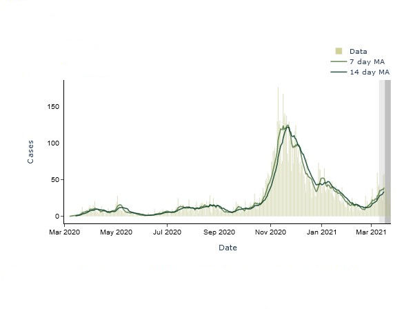
I made my COVID-19 dashboard for southeast Michigan in Python and used the libraries Beautiful Soup to obtain data from the web, pandas for data aggregation and cleaning, and the duo of Dash and Plotly for the web app and data visualizations. This post is a quick overview of the technologies I used to create and host it.
I am interested in data science/analysis and visualization. If you would like to reach out, I hope you will connect with me.
Professional
I previously worked as a Research Analyst at the Federal Reserve Bank of Cleveland where I split my time between working for economists on internal research briefings academic research projects. I have a BA in Economics from The College of Wooster and earned an MSBA from Simon Business School, University of Rochester in 2019.
Fun
At home, you’ll probably find me making a pour over coffee, catching up with the news, listening to new jazz albums, reading, or playing video games. I enjoy running and am proud of finishing my first (virtual) 15K in 2020. I find solo runs are a nice opportunity collect my thoughts.
I look forward to traveling again when the COVID-19 pandemic is under control. I have been to about half of the US states, Canada, England, Scotland, France, Belgium, the Netherlands, Germany, Slovakia, Ethiopia, and Tanzania.


